When the map view is zoomed very far out so that you see whole countries and continents, only a small subset of regionated data will be visible, to avoid clutter. In this case, bridge rating provides a scoring metric, so only the most critical bridges are shown at first. As the view zooms in, more and more bridges will appear until you see all available data for the small piece of the map you are looking at.
The map is only showing the bridges with the lowest condition ratings. Out of total 716,000 bridges, 189,000 bridges, or 26%, are shown. A bridge is shown if its worst condition rating is 5 or less. The ratings go from 0 to 10 for each of several bridge components that are independent from each other(see a separate post for details).
Disclaimer: Federal Highway Administration (FHWA) does not approve, endorse, or recommend this project.
Click here to open the visualization in Google Earth.
 If you don't have Google Earth, download it. If you have Google Earth plugin installed, scroll down to see the embedded view. Otherwise, here's a sample picture.
This was implemented using regionator - a free, open-source program that converts spreadsheets in CSV format into KML files. Feel free to contact me if you would like to know details or learn to do this yourself.
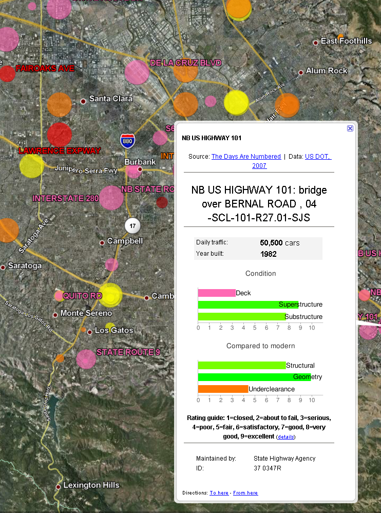
Each bridge is represented by a circle. Click on any of them to open a description balloon. It will show the road names, daily traffic count, bar charts with specific ratings, the year bridge was built and organization responsible for maintenance. All of these were taken from the original data (and dozens of other fields are available). Unfortunately, bridges are sometimes not located precisely where they should be - they could be several hundred feet or more off (some are in Iceland!).
Circle size shows the amount of daily traffic, and circle color shows what the condition of a bridge is:
| Rating | 0 (broken) | 1 (closed) | 2 (critical) | 3 (serious) | 4 (poor) | 5 (fair) |
|---|---|---|---|---|---|---|
| Color | Black | Black | Red | Pink | Orange | Yellow |


4 comments:
Really neat data, and interesting to see what's in my area that has issues. It's unfortunate that the locations are so far off...
It seems to be possible to use crowdsourcing to fix the locations if I add the data to openstreetmap.org layers, but it's not clear whether the updates will be accepted by the data owners.
FHWA gets yearly database/reporting submissions from the State DOT Bridge Maintenance Units, and all this State DOT data then gets aggregated into the National Bridge Inventory database by FHWA. I cannot imagine any of these entities would be willing to accept crowd-sourced location information. In fact, I can just see many of them nearly having a stroke thinking of how to deal with that possibility :)
I have no doubt that none of them will blindly take data from the outside. However, if they had a copy of the data with supposedly correct geolocations, it will be much less work for them to go and verify the cooordinates then to position the bridges themselves.
Post a Comment